Years ago I was really into mail art. Decos (handmade books where people decorate a page), ATCs (Artist Trading cards), Zines, and artist stamps… each project was different and I really enjoyed organizing the swapping. Then the website I did my trading on went down and the fun kind of fizzled out. I still love the idea of a one page zine but also it can be used for a marketing piece as well.
But two of the handmade book layouts stuck with me, the one page book layout. This post is about the first version and Tor.com has a very elaborate example of this here: https://www.tor.com/2009/03/10/idiots-opw1/. With a convention that has a small budget the ability to have an 8 page layout on a single letter size sheet of paper is an interesting idea. It focuses the attention of the reader to one concept at a time rather than trying to seperate the information through layout of the brochure.
I see this type of flyer as a general piece about the convention. This works when trying to convince a person to come to a convention you want to showcase the location of the convention and whatever strength the convention has without being too wordy. For example, Armadillocon has a very literary focus. BBQ. Bats that come out from the Congress Avenue bridge every night during the summer. Great guests.
Edited to add- these days you can have a page with a QR code for more information instead of just the website information on the piece. That can lead to a specific landing page or just your standard website but it gives the person something to take home with the basic information in their hands.
On to the project:
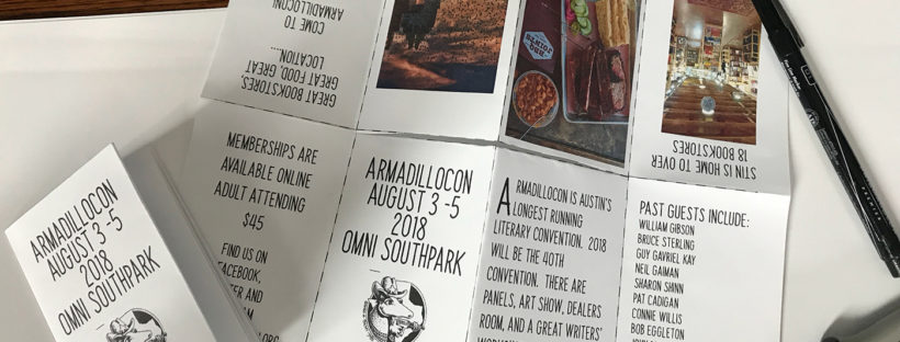
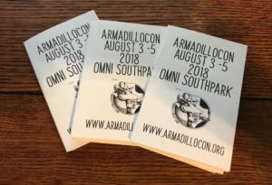
The flyer below is a sample file for you to attempt to fold your own flyer. It is a quick layout I created for my local convention ArmadilloCon.
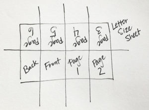
In terms of layout you need to know which panel will be the front and the back of the flyer.

If you look at the Tor version you notice you can pretty much make any of the panels the front and back. Their layout is more dynamic the way the images are drawn the story can be seen folded to create multiple version.
This version I have created is static.
Layout the design you want for your little book. The front and back have all the basic convention information, where, when, how much, website for purchasing memberships. Then the next two pages are the overview of the convention, what happens at the convention and past guests. And finally, something about why you would want to visit Austin. Pretty basic. (Again really quickly put together so I would hope your grammar is better than mine as well as the content is a bit more focused and targeted to the audience)
Depending on what kind of printer you are using you cannot lay out the text to the edge of the sheet and print at home. I played around for a while trying to find a good width for the outside pages and a good height for all the pages.
Now how to fold the piece.
If you want a layout with the pages marked off for you to try yourself I have included that as well.

